Anvaya
Branding Strategy
View Full File
The Brief
Anvaya's founders knew that good intentions aren't enough in social impact — you need strategy, and you need it executed right.
As a newly formed consulting firm focused on bridging governments, CSRs, nonprofits, and communities, they understood that their sophisticated systems-level approach required equally sophisticated brand execution to build instant trust and credibility across wildly different contexts.
They came to us recognizing that strategic branding wasn't optional; it was a critical foundation that would determine their ability to convene stakeholders and drive real change. While their strategic thinking was sharp and their mission clear — closing the execution gap between well-crafted policies and last-mile impact — their brand expression was starting from zero. No visual identity, no consistent voice, and presentation materials that fell short of their strategic caliber.
Their natural instinct to showcase the full breadth of their capabilities risked diluting their core message. The challenge was to translate their nuanced, multi-stakeholder methodology into a brand identity that could command respect whether addressing a district collector, a corporate foundation head, or a village self-help group leader.

Branding
Brand Identity
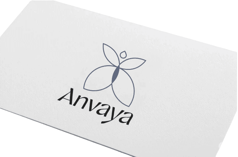
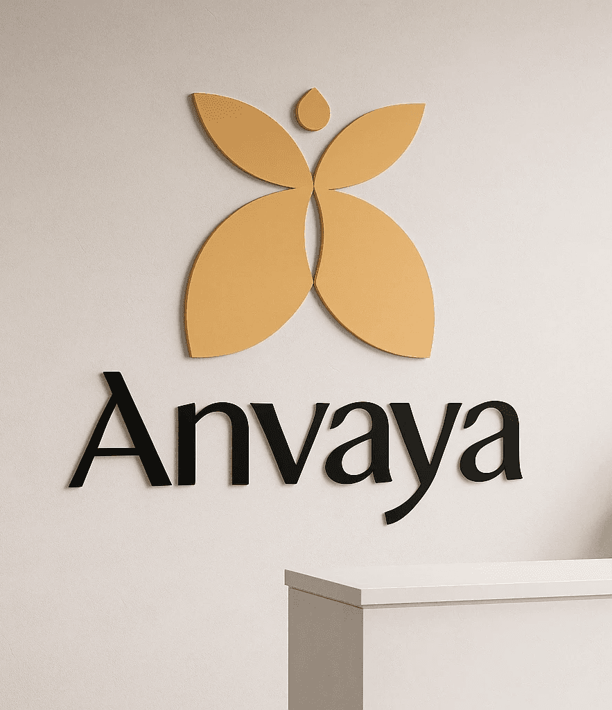
The foundation of Anvaya's Brand Identity was built on the circle - a shape with no edges and end - it represented the circular nature of the work they delivered to the community and their engagement with players in the private and public sector.
Brand Palette
Terracotta Root
Harvest Gold
Neem Green
Indigo Insight
Cotton Mist
Charcoal thread

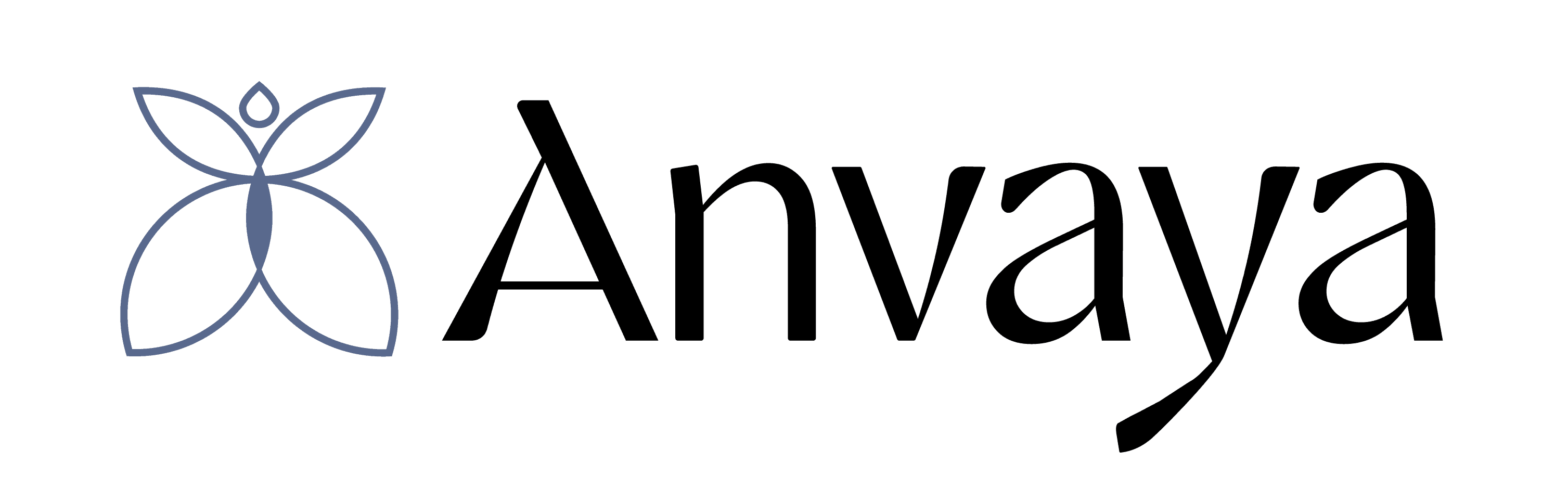
The LOGO MARK
We crafted a visual identity that reflects Anvaya's role as a living, balanced system — rooted in community yet open to evolution. The butterfly-mark symbolizes transformation, connection and the flow from source to impact.
The Logo


The SCRIPT

ENGLISH
WORDMARK

HINDI
WORDMARK

The WORDMARK
We crafted a visual identity that reflects Anvaya's role as a living, balanced system — rooted in community yet open to evolution. The butterfly-mark symbolizes transformation, connection and the flow from source to impact.
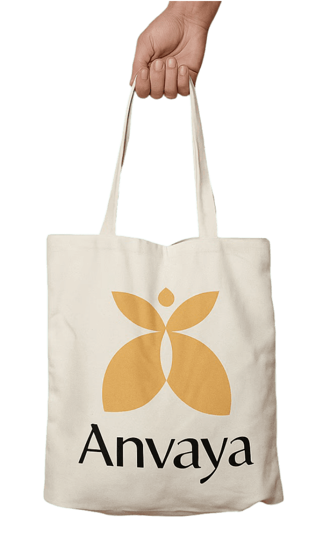
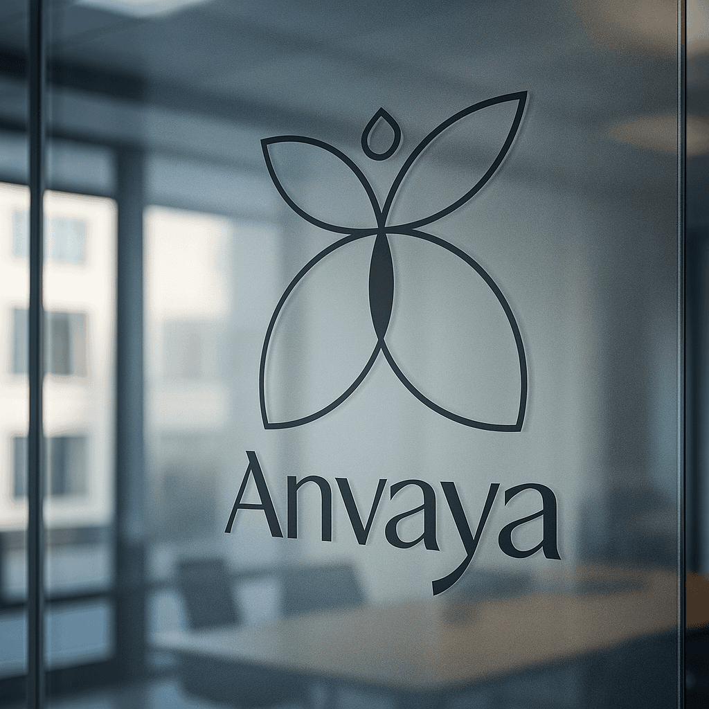
Corporate COllaterals


The Outcome
We built Anvaya's brand identity from the ground up, creating a symbol that perfectly embodies their collaborative philosophy.
The logo strikes a remarkable balance — it reads as a butterfly symbolizing transformation, but also suggests a human figure with arms outstretched in welcome and alignment. This dual interpretation captures exactly who Anvaya is: facilitators of change who lead with warmth and openness.
The design achieves something rare in the consulting space — it feels genuinely warm and human without sacrificing professional credibility. While most consulting firms default to cold corporate aesthetics and NGOs often feel overly soft, Anvaya's identity occupies a unique middle ground that's both approachable and authoritative.
The warm color palette reinforces this positioning: even the primary purple-blue line work feels inviting rather than sterile, while the secondary yellow brings comfort and optimism. Crucially, the logo's solid base literally grounds the symbol, reflecting Anvaya's commitment to field realities and community-rooted solutions.
The result is a brand that can command respect in government boardrooms while feeling genuinely welcoming in village meetings, perfectly embodying their role as bridge-builders who believe alignment starts with trust.


Crafting clarity into every brand story
navigation:
© 2025 Highland Creatives™
A brand by Sapphire Highland.