
Quick Pay

Strategy | Marketing
View Full File
The Brief
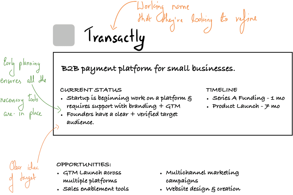
QuickPay is a concept B2B payment platform designed to explore how modern fintech brands can better serve young entrepreneurs. This project challenged us to create a complete brand identity for a demographic that values speed, simplicity, and authentic connection over corporate complexity.
The Challenge: Design a payment brand that feels native to the startup ecosystem—trustworthy yet approachable, professional yet energetic. How do you build credibility in fintech while speaking to entrepreneurs who expect better than legacy processors?
The Opportunity: Explore branding that makes complex payment infrastructure feel beautifully simple through strategic naming, visual identity, and user experience design.
Strategy

Brand NAming
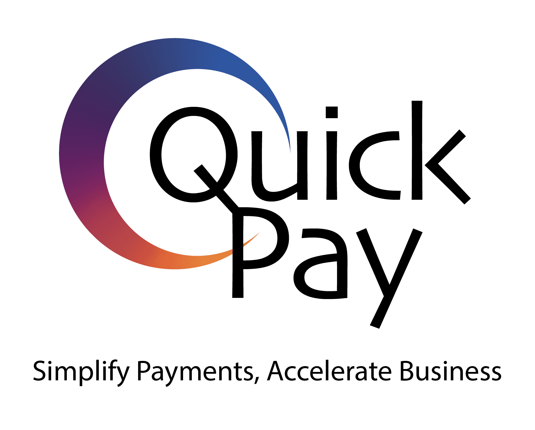
Developed "QuickPay" to instantly communicate the core value proposition—speed and simplicity in payments. The name testing process revealed shorter, action-oriented names performed better with target demographics.

Brand POSITIONING
Crafted positioning around three pillars: Fast, Reliable, Compliant Payments. Clear differentiation strategy in the crowded fintech space.
Branding
Design Philosophy
Our approach focused on creating visual elements that matched the brand's promise of speed and simplicity.
We designed unique, quirky typography with fluid strokes that embody the ease QuickPay provides for global users.

TARGET AUDIENCE UNDERSTANDIG
While designing QuickPay's Identity, we had to remember that the brand would predominantly target young entrepreneurs, who represent a new age of business - starkly different from the industrial era.
To better reflect this demographic, we chose vivid colours that, alongside the quizzical logo, provided a sense of stability.

The logomark's circular motion represents completion, while the gradient suggests movement and progress. Every element was crafted to build trust while maintaining the energy of a startup culture.
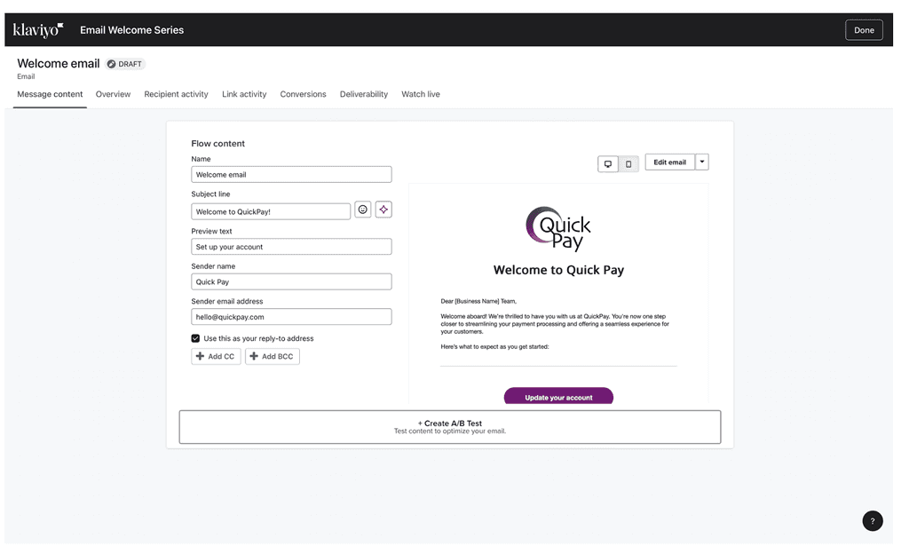
Email Automation
FRamework
Designed comprehensive email automation flows for user onboarding and engagement. System concept focuses on guiding users through platform adoption without manual oversight.
OnBoarding Sequence

The Outcome
We built a complete concept brand that demonstrates how fintech can authentically connect with modern entrepreneurs through strategic design and positioning.
Strategic Brand Development
QuickPay name and identity system shows how thoughtful branding can instantly communicate value while appealing to target demographics.
Modern Fintech Identity
Visual approach proves financial brands can be both trustworthy and energetic, speaking to entrepreneurs who expect innovation from their tools.
Systematic User Experience
Email automation framework demonstrates how strategic communication design can scale engagement efficiently.
Category Differentiation
Brand concept illustrates clear positioning strategies that help modern fintech stand apart from legacy competitors.


Crafting clarity into every brand story
navigation:
© 2025 Highland Creatives™
A brand by Sapphire Highland.